Sun 18 Dec 2011
I don’t know about where you live, but it has suddenly turned to winter here. The last of the leaves have fallen from the trees, and the air is taking on that cheek-stinging quality of a winter chill. We’ve even gotten a snow flurry or two, certain proof that winter is on its way.
Before we say goodbye to fall entirely, though, I wanted to revisit some of the fall colors in my dyepots. I know I can never get enough of these colors, and judging from the comments section I’m guessing that most of you feel the same.
One of the fun things about dyeing more frequently is how much it changes the way I see color in the world. I’ll be driving along on my morning commute, and there’s a new colorway around every turn. When I look at art, I notice more about how light and shadow combine, and I’m constantly looking for the colors within a color (is that a blue-brown, or a pink-brown? Or maybe grey with a hint of green and a tinge of orange?). Â What’s even more fun is that it seems to be rubbing off on you, too.
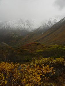
My friend Carolyn is off on a great antarctic adventure at the moment, but she sent me this photo from a trip to Alaska, asking if I could make it into a colorway.
Do you see all those colors in the brown? There’s green, and yellow, and especially red in there. There’s the grey-blue of the clouds, and then the grey of the mountains, and the deep gold of the autumn leaves at the foot of the photo.
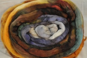
When I first saw the image, I knew that I wanted to dye it as a gradient, with all of those colors stretching from one end of the fiber to the other so you could spin your way from the leaves all the way to the mountains and sky. I laid the fiber out for a two-ply yarn, and then began painting each section. The sky was a combination of pale green-blues and grey, almost too faint to see on the white of the fiber. Then came the blue-gray of the mountains, fading into brown overlaid with reds, orange and green. At the very end came a touch of gold, mixed with browns to keep it from being too yellow to wear. Each section overlaps slightly with the next, and I used the same dyes across the fiber to make sure that they’d end up in harmony. I also made sure to leave areas unsaturated with dye to capture the variation in light and dark in the texture of those hills.
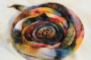
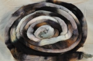
I also dyed a dappled version, with all the colors mixed together.
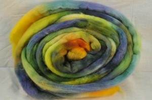
Here, the reds bled into the greys in places, which brought out a little bit of unexpected pink, and the whole colorway leans a bit more toward the gold (note to self: yellow is a dominant color. A little goes a long way). Both colorways have a bit more blue in them than the original photo, because I mixed in a navy dye to make the greys. On my sample cards, that mixture gives a very rich slate blue; here it leans a bit more toward a denim color.
(Since Carolyn is in Antarctica and can’t really check email all the time, she got to pick her favorite before I published this post, so the long gradient fiber won’t be in the Etsy post.)
Next, I started on a a series of inspirations from the Twinset blog. (You two really do take good colorway photos. I could keep going for months, just stealing pictures from your blog.)
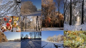
Back in October, Jan posted a picture of the early snowfall that hit D.C.
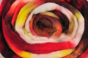
The one on the far left of the second row really caught my eye. All those bright reds and yellow-greens, laid against the black of the branches and the white of the newly fallen snow. When Jan first took this picture, I said that I didn’t think I’d be able to get wool white enough for the snow. But then I dyed the Whitecaps colorway with the new Falkland fiber, and thought again.
It didn’t come out absolutely white, because red dye always leaks on the first washing. I washed the heavily dyed sections first, and then rinsed the whole fiber together, so the bleeding was limited, and I did end up with some sections of pure snowy white.
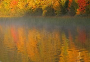
Then, there were two photos from Ellen’s fiber retreat, also in October (must have been a good month). The first is one that I’m calling Fall Reflections:
Unlike the other fall colors I’ve dyed, this one is tempered by a lot of grey and even a touch of green (look at the water, just under the tree line). And then, of course, there are the fiery colors of the trees themselves.
Again, my grey leans a little blue, and I didn’t catch quite as much of the orange as I was hoping for, but it is in there. This fiber holds almost the whole rainbow, really.
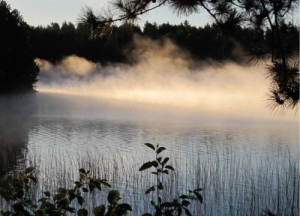
Finally, I turned to the last image in the same post, a beautiful photo of steam rising off of the water.
The contrast in this one really fascinates me. There are the black, black shadows of the trees, and the pink-white of the mist over the pale blue surface of the water. I also see a little bit of brown in the mist, just at the edges where it mixes with the black.
Here, I almost need a touch more blue in that grey, but this has to be one of my all-time favorite colorways, if only because it goes so well with all the colors I love. Last time I posted about dyeing, we took a few paired photos as an experiment, and it instantly became my absolutely favorite part of taking fiber photos for the blog. It is so much fun to dig through a box of fiber and see what goes together! (As Branden patiently takes a hundred more photos…)
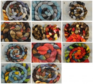
Rather than go through them one by one, I thought we’d try a composite image this time (click to enlarge):
1) Alaska Mountain (gradient version) and Misty Water
2) Misty Water and Sea Green (links go to the original post for the colorway – all of these colorways are also available on Etsy as of this posting, except for the Alaska Mountain gradient)
3) Misty Water and Fallow Fields
4) Fallow Fields and Alaska Mountain
5) Fallow Fields and Early Snowfall
6) Fallow Fields, Early Snowfall, and Fire Maple
7) Alaska Mountain and Storm Green
8 ) Alaska Mountain and Red Oaks
9) Fall Reflections and Fire Maple
10) Fall Reflections and Sea Green
11) Alaska Mountain (gradient) and Alaska Mountain
We’re always more careful to get good color on the individual fiber photos, so it’s good to go back to the original post if you want to see the exact colors of one of the fibers. Still, I like seeing the two colorways side by side like this, and it’s fun to figure out what different combinations will go well together. Each pairing highlights different aspects of the fiber; sometimes a particular color is the dominant one, and sometimes it almost disappears. By changing the partner colorway, you get an entirely different effect. Look at the Alaska mountain with Fallow Fields (#4) and with Red Oaks (#8), or even with Storm Green (#7). You’d get a completely different yarn from each one of those.
I’m sure these fall colors will be back again one of these days. For now, I’m really enjoying this last little burst of color before we give in to the winter grays.
As usual, you really nailed it! And I love the color combos you put together. I’m learning a lot from you! I can’t wait to see what you do with Ellen’s montage of foods from her recent trip!
I love seeing the photo inspirations with the end dyed result. I know what you mean, too, about seeing colors in nature and art differently–I took some art classes in high school and started seeing way more colors–tree leaves aren’t just green, clouds aren’t just white. Fun!
Wow. I love the fall reflections one!! Love it! And the combination of misty water and sea green is amazing. Hmmm… I wonder how the BFL and Polwarth would ply together? Hmmm….
Wow.
The Misty Waters is my favorite I think (well, besides the AK Mountains colorway I already claimed).
I would have never thought to put those colors together without the photo.
Love your dyeing! The whitecaps and and neutral colored lake one are lovely!
I am loving them all, but when I scrolled to the misty waters, I sucked my breath in – it really captures the feeling of watching that mist roll down the river onto the lake in the early morning. You can almost hear the loon.