Entries tagged with “dyeing from photos”.
Did you find what you wanted?
Wed 28 Mar 2012
The picture gods have smiled upon us, and I finally managed to get the right lighting conditions for good color photos of some of the new fibers I’ve been dyeing lately.
My color moods are always influenced by the season, so I suppose it’s no surprise that all I see are the colors of spring. There are happy daffodils dancing in the breeze:


And then there are crocuses opening in the sun:


I also found some of the leftovers from last years’ garden in my dyepot.


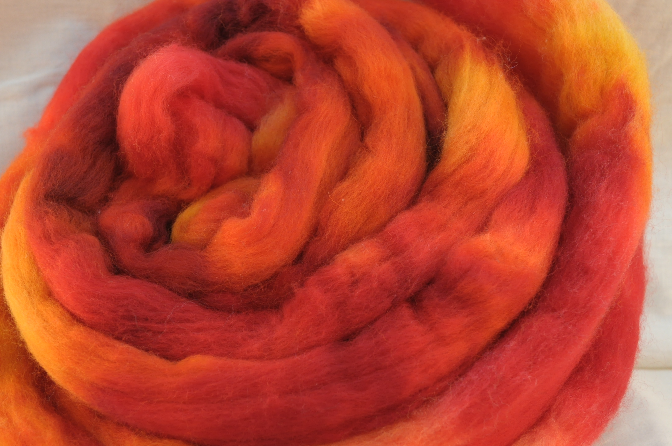
I dyed up some of the new rambouillet last week:


And this week, I have started moving out of the semisolids and into gradients, my next great adventure.


This fiber has 6 different concentrations of dye painted on it, going from pale all the way up to the most concentrated stock. I dyed this one with the fiber folded in quarters, because that’s what I had presoaked that day. Next time, I think I’ll fold the fiber in half instead, to get a longer repeat. This color looks beautiful with the dark walnut brown.

The names for the colors shown above:
Daffodil (Falkland) and Olive (Falkland)
Pale Crocus (Polwarth), Deep Crocus (Polwarth), Saffron (Polwarth), and Brilliant Green (BFL)
Faded Fall (Shetland)
Caramel (Rambouillet)
Walnut Brown (Rambouillet)
Spruce gradient (Rambouillet)
All of these fibers are available on Etsy.
Sun 20 Nov 2011
I must go down to the seas again, to the lonely sea and the sky,
And all I ask is a tall ship and a star to steer her by,
And the wheel’s kick and the wind’s song and the white sail’s shaking,
And a gray mist on the sea’s face, and a grey dawn breaking.
I must go down to the seas again, for the call of the running tide
Is a wild call and a clear call that may not be denied;
And all I ask is a windy day with the white clouds flying,
And the flung spray and the blown spume, and the sea-gulls crying.
I must go down to the seas again, to the vagrant gypsy life,
To the gull’s way and the whale’s way, where the wind’s like a whetted knife;
And all I ask is a merry yarn from a laughing fellow-rover,
And quiet sleep and a sweet dream when the long trick’s over.
-John Masefield
I grew up in Plymouth, MA. Land of the pilgrims, steps from the sea. The Atlantic ocean is a daily part of life there; you really can’t go anywhere without catching a glimpse of it here and there through the trees. The north Atlantic is a moody sea, a body of water with its own strong personality. If you live near it long enough, it becomes a part of your life, a character in your story.
When we left New England, I couldn’t imagine not living near an ocean. With the exception of a summer in upstate New York, I had spent most of my life not 5 miles from the coast. You get used to the smell and the sound; the salt air wafting in on a morning mist, people flocking to the shore in the summer. The off season has a different feel – then you see the hard, unyielding, and rocky side of the coast, the cold, biting wind, and the beautiful rolling waves of a winter storm. The passion and the fury of an untamed sea. Calm or angry, the ocean is unchanging, and yet never the same.
Linda and I were emailing a while ago, and she mentioned that she had seen a particular green in the ocean while out on a boating trip but hadn’t been able to capture it with her camera. She didn’t need to; with a bit of description, I knew which color she meant. I thought I might even have some photos of it myself, but we bought our first digital camera after leaving Massachusetts, so I have almost no pictures, except the ones held in my mind. Still, it got me thinking of all the colors and moods of the ocean, and of ways I might try to capture those colors on fiber.
Last weekend, I gave it my first attempt, on BFL and Falkland.
There is the color of the sea at sunset, waves lapping on a sandy shore. In the summer, sunset is the time that the locals head to the public beaches; the sand is less crowded and parking is free. As the sky turns gold, the water takes on a greenish hue.

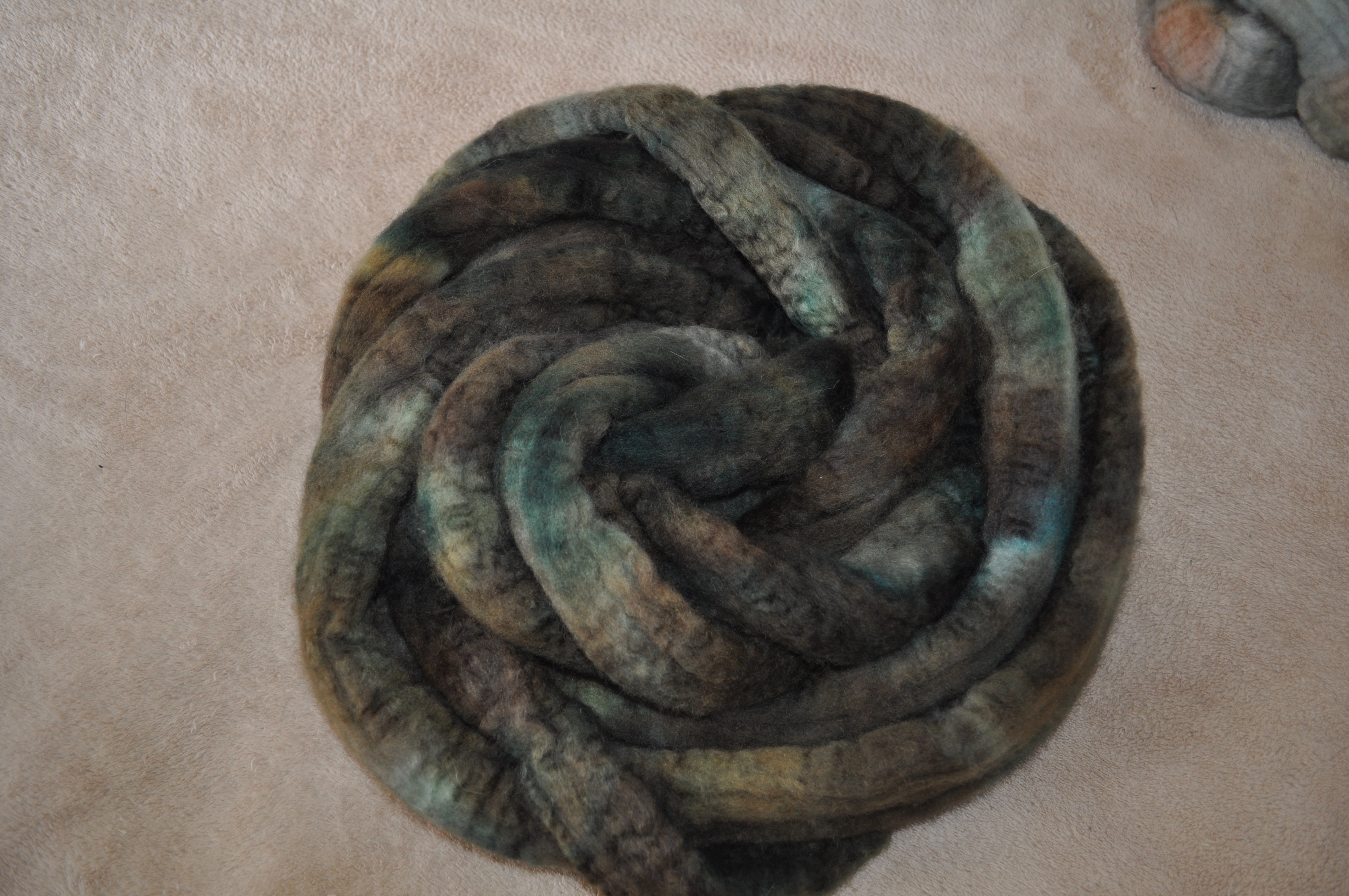
In the winter, you’ll see those same greens mixed with grey on a cloudy day.

In a storm, the colors deepen and mix with a hint of brown.


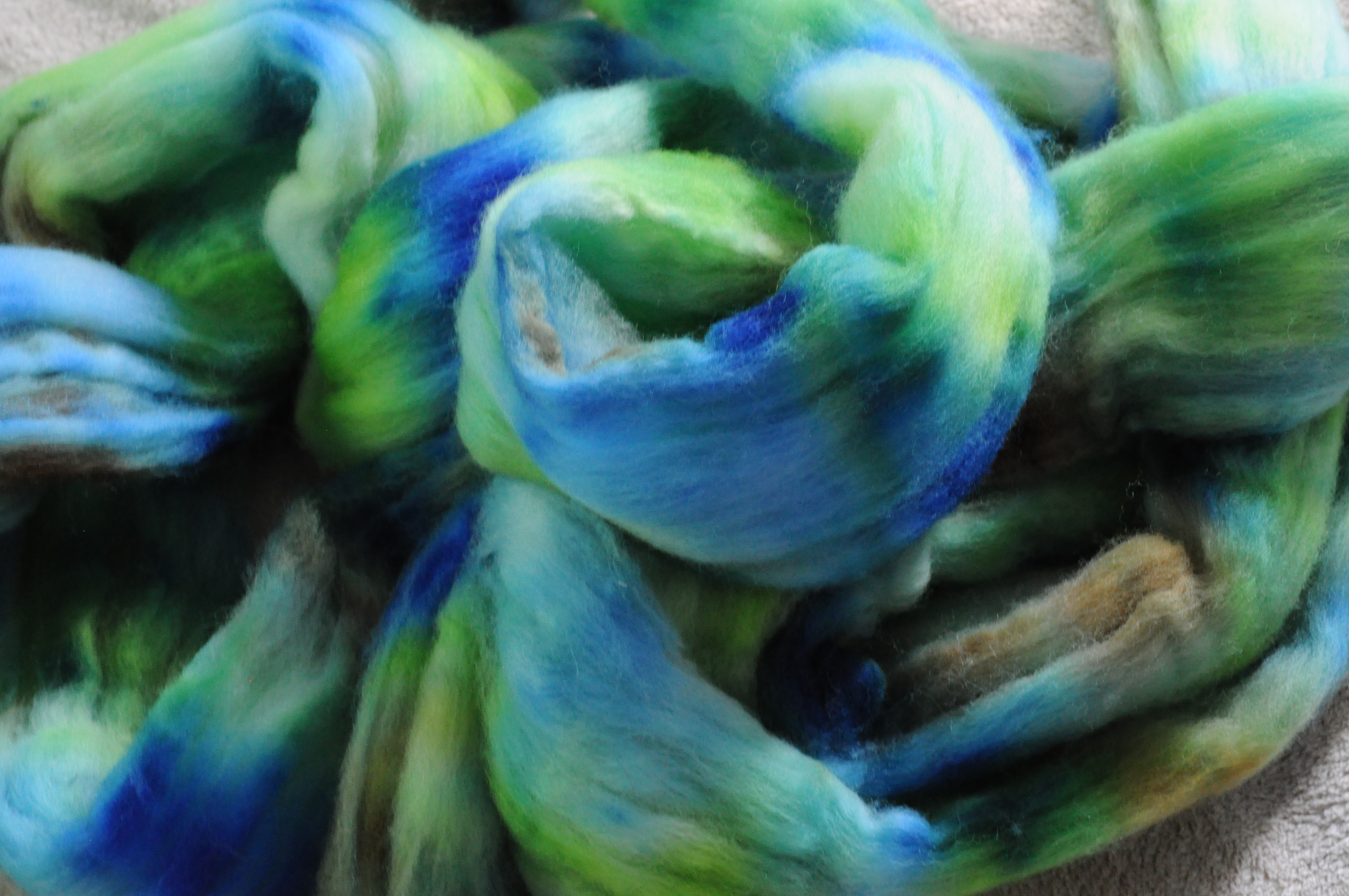
The summer sea is a different creature; laughing and throwing waves lightly on the shore. Whitecaps dance across a sapphire blue, and children play in the foam. For this color, I made sure to leave long repeats of pure white so that those whitecaps will show.

I can almost hear the waves.

On calm days, waves rise up to touch a cloudless blue, and the water can almost take on the same color as the sky. The horizon disappears, and all there is is a vast expanse of blue.


Throw in a little grey, and you have the moodier color of a winter ocean. The water just looks icy cold, stretching out forever beneath a pale grey sky.

I’m not sure I found the green that Linda was talking about; the green of a sea churned into foam by the passing motor of a boat. I know which one it is, and I don’t see it here. There are an infinity of colors to be captured, and I think I missed that one. I know it’s in the dyepots somewhere, but I’ll need to sample more to find it.
I won’t mind coming back to these colors again, though. They do make me ache for the ocean, but it’s hard to resist the pull of those blues. I could wrap myself in any one of them.
It was really interesting to see the Falkland next to the BFL. BFL has a shiny, high-luster appearance, like silk. The Falkland is a more matte look, fluffy and soft, almost like a chenille or a velvet by comparison. We couldn’t quite capture the difference in a photo, but this one comes pretty close:

That’s Falkland on top, and BFL on the bottom. The lighting isn’t great, but you can see that there’s more shine from the one on the bottom. Personally, I’m in love with the squoosh of the Falkland at the moment, but that silky look is pretty nice, too.
A couple of people have mentioned the idea of sets of colors for the shop. I like to let customers choose their own mixes, but I usually dye several colorways at once, with the idea that they will kind of go together. I have a core set of dyes that I really like to use, and so those colors show up again and again in different mixtures and on different fibers. I’ve added links to the Etsy posts for colorways that I think will coordinate, and thought I’d show a few photos of these colors next to each other, to give you some ideas of how to mix your own sets if you like.
There’s the Storm Green and Winter Greys:

And the Sea Green and Winter Greys together:

These two are so similar that it’s really hard to tell that there are two, but that’s the Winter Greys on the inside. If you plied the two colors together, you’d definitely get a single colorway. If you spun them separately, you’d get a subtly different pair.
Whitecaps and Sea and Sky are the same basic dyes in different saturations, so they could easily be spun together:

There are so many combinations, and I’d mix colors differently depending on the kind of yarn I wanted in the end. If you’re ever considering two items in the shop and want a photo of the two together like this, let me know.
We also took pictures of my favorite fall colors roving today. It got left out last time for bad behavior because we just could. not. get the colors right…the reds were too intense for the camera. Today, we used a different lighting setup, and Branden managed to capture it.

Those fiery reds pair really, really well with the Fallow Fields roving that I dyed on the same day:

That’s it for my latest dye day. All the fibers shown are over on Etsy.
I received a box the other day containing these,

so there’s bound to be more color coming soon. I’ve even moved up to 8 oz jars for my favorite dyes now…somehow that feels like entering the big time.
Sun 18 Sep 2011
A while ago, Linda sent me a series of photos, suggesting that they might make a good colorway.
Since I love purple (and pansies!), I was excited to give it a try. And so I sampled.
I ended up with a huge range of colors just from combining a few of my dyes in different ratios. And then, the trick was to choose the right colors to match the photos. This was my favorite of the photos she sent:

Look at all those cheery little faces! I particularly wanted to capture that bright spot of yellow in the center of the flowers. I also wanted to capture the gradual transition from blue to white. After much hemming and hawing over which purples were exactly right, I ended up with this fiber:

By keeping the color patches shorter than a staple length in most cases, the colors should blend as the fiber is spun, hopefully giving a gradient from pure purple all the way down to white. I left a lot more white on the fiber than I normally would, both to represent the white and blue flowers, and to give room to spin the yellow without mixing it too much with the purple. (In places where it does mix, I think it should give quite a nice green, judging from the couple of spots where the color touched on the fiber. You can see a tiny bit in the lower right corner of the photo.)
Next, I focused on these little beauties.

Here, I loved the little veins of dark blue running through a shaded purple. I started out with a purple base, and then added highlights of dark purple mixed with blue on top.

The dark “blue” here is really a violet blue. I took photos of these fibers once with my camera just after I dyed them, then Branden tried a few days later. At first, we blamed our lack of success on poor lighting (evening shots are never as good). Then, yesterday, Branden spent about two and a half hours taking photos of these four fibers before we got even close to color accuracy. Apparently purple is just hard to photograph. We have explored whole new frontiers in camera settings, and this is as close as we could get. So imagine that those dark blue regions are really a more intense version of the light purple (which did come out accurately), with a bit more blue added.
The next two rovings were even harder to photograph, but I think we did finally manage to get accurate colors on them. The first was actually supposed to be a colorway from this photo, which Linda processed in photoshop to help the colors stand out:


Aren’t they beautiful? I especially like the impressionist one; it really could be printed and hung on the wall.
Unfortunately, I got distracted while I was mixing the dyes for this color, and forgot to add blue to one of my dyes. Instead, I ended up adding red twice, which meant that I really didn’t get the purples I was going for.

You can see hints of the iris colors in there, where the dyes with the right mixture stayed unmixed, but this really wasn’t where I intended to go with this fiber.
Sometimes the dye has a mind of its own, though, and in this case I was amused to discover how  little this “mistake” colorway had strayed from our theme. When we were at the farmers’ market yesterday morning, we saw this little guy:

Branden snapped a picture on his phone, and later we compared it to the not-iris colorway. As it turns out, it just wanted to be a maroon pansy instead.

And finally, I made a deep, saturated colorway in purples and blacks, inspired by this photo:


I made a mosaic here, too, to help me pick out the colors. Isn’t it amazing how many shades there are in that one photo?
I didn’t have quite the right purple for this photo in my samples. I think the blue needs to be a little more subdued than the dyes that I have. So I added black to most of the purples, and then added some spots of pure black to deepen the color even more. I ended up with this:

It’s not an exact match, but I think it’s pretty close. Of all the colorways I dyed from these photos, I think this one is my favorite. I am working hard to resist the urge to claim it for myself.
So that’s my exploration of pansy purples. There are so many colors you could create from these photos that I think I’m likely to return to this colorway series someday. I’m especially interested to keep sampling in the purples region of the spectrum, because I picked up some navy blue dye at WI Sheep and Wool last weekend that I think it might just give me those shades that I’m missing in the black velvet sample. And really, I would wear any one of those colors, so more experimentation is probably in order.
Sun 14 Aug 2011
I still can’t talk about the secret roving, but I thought I’d show you the other two colorways that I dyed along with it. I’ve been enjoying using photos as a jumping-off place for my dyeing, and so both of these colors began as photos.
A week or so ago, Branden sent me a link to this fabulous photo of some very colorful ducks sitting on a log:

The photo was taken by Alan Shapiro, and he has lots of other great photos on his website; check it out, if you get a chance. The people photos are particularly striking; there’s one of an old lady that I love – she is just the essence of an Italian grandmother on a mischievous day.
When Branden sent the photo, he naturally expected that I would be interested in the ducks, but all I could see was that water. Look at those greens! There’s even yellow in there, when the sun hits it just right. Not at all what I’d expect from water, but I fell very much in love with the colors. Here they are on Polwarth:

The final yarn ended up a little heavy on the yellow; I was worried about bleeding between the colors, and so left wide open swaths of yellow. The shading is beautiful; I love the way the different greens mix on the fiber, fading from deep spruce all the way down to sunshiny yellows.

There’s just something about greens that is catching my eye at the moment. I’ve recently discovered Pinterest, and have started a collection of photos for color inspiration. This one just jumped out of the collection the other day:

It’s from
National Geographic, and it’s a photo of a sea anenome. Aren’t those colors amazing? Look at all the shades of green and blue in there. And then there’s just a tiny touch of brown in that center region and the stripes that radiate out from the core. Funnily enough, the greens are almost the same as the ones that I used in the Duck Water fiber, just diluted down with only a few strong highlights.

I wanted to encourage mixing of the colors in the final yarn, so I used small patches of color rather than large sections. It should make for a shaded, blended effect, with just a few dark flashes here and there.
I love how these came out, and I’m definitely planning to continue drawing inspiration from photos. It leads to so many unexpected color combinations, making a much more interesting fiber than I’d come up with all on my own. (It also helps to get over that blank page syndrome where the potential of the white fiber makes it hard to apply that first little bit of dye.)
I’m also fascinated by how different the final fiber can be, working from one set of base colors and just varying the strength and proportion of the dyes used. Since they come from the same color family, these fibers would work beautifully together, but drawn from different sources they can also stand on their own.
So there you have it. Two of the first fibers dyed in the new studio. They’re over on
Etsy now, and will be joined soon by a third, once a certain someone gets her surprise package. The third is yet another variation on these same basic colors; I can’t wait to show you more!
Sun 22 May 2011
This is the first weekend in about two months that we have had nothing that has to be accomplished before Monday. (Well, there’s packing, but that will always have to get done…) It’s nice to have a couple of days off once in a while!
To celebrate, I spent yesterday dyeing. This time, I tried Jocelyn’s request for a Kestrel-colored yarn. There’s another photo here, in case one isn’t enough. They are beautiful birds.
This time, I was able to find colors in my sample card that came relatively close.

I wanted a little more orange in the brown color, and a little more blue in the black-blue mix, but it was close enough to make minor adjustments on the fly. That beautiful cream color is a very, very dilute mixture of pumpkin orange. I used that as my base dye, and then added accents of a slightly higher concentration. On top of that, I layered sapphire blue and black, and a mixture of chestnut and pumpkin orange. My sample up there is a 3:1 ratio, which I upped to 5:1, but you’d never be able to guess there’s that much orange in the reddish-brown color that came out. I had no idea that brown would be such a dominant color in a dye.
But that’s probably enough of the particulars, yes? You probably want to see the actual fiber.

I am thrilled with how this came out. The brown was a tad bit browner than I expected, and there was less of that creamy butterscotch than I was expecting, but I think it’s perfect. I’ve been petting it every chance I get. I’m a tiny bit worried that the colors will mix too much in the spinning, since the dark colors bled a bit into the light and it ate up my light-colored spacers that were supposed to prevent mixing. But I think it will be ok. Carefully spun, I think the colors should stay separate. There are only a couple of spots where the blue and orange bled into green, and they’re very small. So, I pronounce this one a success.
Here it is all braided up for Etsy:

As usual, I dyed a few different things all at once. I had a few ounces of BFL left over that weren’t quite enough to sell, so I used up some of the pumpkin dye making a beautiful butterscotch top.

I’m not sure what it will be; it’s not a color that I wear much, but I can see mixing it in with something else, just for fun.
And then I dyed another four ounces for sale.

I had some extra black dilutions left over, so I mixed those with a tiny bit of teal to make a fiber that looks like the dark, angry clouds of a summer thunderstorm. I’ll probably even get to compare it to reality this afternoon, since we’re supposed to be having some stormy weather again. That one is also on Etsy.
And finally, another one for me. When I bought my last shipment of fiber (well over a year ago now), I bought several 8-oz bundles of wool breeds I’d never tried before. I’ve been anxious to play with them, but just hadn’t gotten around to dyeing them up yet. Yesterday, I dyed up some Polwarth in shades of teal.

This is destined to be some very fine laceweight. My sister is getting married in August, and I want to make a lacy sweater to go with the dress I’m planning to wear. I think I got the color right, don’t you?

Sat 12 Mar 2011
I posted last week about the samples I made in preparation for dyeing the February Cardinal roving based on Ellen’s picture. I also dyed the fiber, but I didn’t get it done in time for it to finish drying for pictures. We fixed that little problem this morning, so without further ado, here are the results of my little experiment.
I dyed four different colorways, three that were aimed at actually reproducing the colors in the picture, and one that was just riffing off of the new colors on my sample cards.

The first two that I dyed didn’t come out quite as I had hoped, but (as usual) I love the way that they did come out. Both rovings use the same set of colors, but one is balanced more toward the light end of the spectrum,

and the other has more dark.

Put together, though, they’re hard to tell apart.

This pair shows the problem with dyeing high-contrast colors right next to one another. Without some kind of gel thickener, the colors tend to bleed into one another. The dark dye also tends to take over the light regions, evening out the (purposefully uneven) dye application. It produces beautiful results, but it’s not really the representation of a dark forest with a brilliant flash of red that I was going for.
The next roving is my favorite of the bunch. It’s just a combination of very pale colors, all toned down with a tiny touch of gray. There’s a blue, and a green, and a brown that give the hint of color, and the three combine to make a very softly variegated fiber that stops just short of being pastel.

I absolutely love it, especially in the shiny blue-faced leicester roving.

The last roving came the closest to what I wanted. That’s especially good, because I made 8 oz of this one (and only 4 oz for each of the others). This time, I left out the red, and focused on the deep-dark greens.

I tried to leave some pale spots, but again the dark colors bled in and mostly filled the space I’d left undyed. There are some spots that echo the trees in the foreground, but most of this roving is based in the shady greens in the background of the photo.
Instead of putting red into this fiber directly, I kept a small piece aside and dyed it separately, to be added in at will during the spinning. This makes a bright, pure red for maximum contrast with the green, and without the problem of the two colors bleeding into brown.

I think it would also be fun to spin this way, adding in a cardinal here and there on a whim, whenever it seems like there’s a little too much solid. It wouldn’t take much to have a forest full of them, peeking out from between the branches.

In all, I think this was a pretty successful experiment. One roving came close to what I had envisioned, and the others took me in directions I wouldn’t have expected to make fiber that I really like. It added a few more colors to my sample cards and made a few more pieces for the shop. And best of all, it was fun to do. I definitely think we’ll be trying this again soon.


