Archive for November, 2011

I’m afraid I’ve been knitting and spinning more than I have been posting lately, and I am developing quite a backlog of things to tell you about. For tonight, I think we’re a bit overdue for an update on the Fall Colors sweater, yes?

Over the past couple of weeks, I have been turning this:

into this:

(Actually, I’ve finished all the brown, but I really liked the comparison of the original top and the final yarn.)

The Finn didn’t get at all sticky this time, and it has been absolutely beautiful to spin. It’s a nice fiber even when I get it wrong, but when I get it right, it’s amazing.

The colors also came out really well on this one. They ended up a little lighter than I expected in the final yarn, so I may have to overdye a bit at the end to darken it up a bit. I was expecting to get the balance shown in the first color; mostly dark with a few light spots for contrast, but it came out just the opposite. I’m working to come up with a design modification that will let me get around overdyeing it, though, because I really, really want to keep all those subtle color changes in the yarn. (I have been agonizing over this enough that there have even been suggestions that I should just dye up more fiber in a darker color and keep this yarn for something else. It is a tempting offer, but I think I can make it work.)

When I dyed this fiber, I knew that I wanted to match the original red-orange colorway. I used the same brown dyes that I had used to accent the red-orange fiber, and then added in a tiny bit of the orange and even a little bit of green. You can’t see it too well in the photo above, but it’s there. I was surprised to see how much that came across in the yarn. There are sections where one ply is a deep, olive green instead of brown, and a couple of spots where it lightens up almost to orange. I’m hoping that will help to tie the colorways even closer together in the final piece.

I used the same strategy for the green, dyeing it with the orange as a base dye and adding teal to make the green I wanted. Then, I threw in some dabs of brown here and there, and a slightly lighter green to brighten things up.

So far, I think they go really well together.

I started spinning the green at the Spinning Guild meeting on Monday. I can’t wait to see how it comes out!

There comes a moment in every crazy project where you have to decide whether to dive in or whether to save your sanity and walk away.

I had to stop and consider when I got to this:

which was really only marginally improved by becoming this:

But then, I have visions of this to keep me going:

Sanity is overrated.

I must go down to the seas again, to the lonely sea and the sky,
And all I ask is a tall ship and a star to steer her by,
And the wheel’s kick and the wind’s song and the white sail’s shaking,
And a gray mist on the sea’s face, and a grey dawn breaking.

I must go down to the seas again, for the call of the running tide
Is a wild call and a clear call that may not be denied;
And all I ask is a windy day with the white clouds flying,
And the flung spray and the blown spume, and the sea-gulls crying.

I must go down to the seas again, to the vagrant gypsy life,
To the gull’s way and the whale’s way, where the wind’s like a whetted knife;
And all I ask is a merry yarn from a laughing fellow-rover,
And quiet sleep and a sweet dream when the long trick’s over.

-John Masefield

I grew up in Plymouth, MA. Land of the pilgrims, steps from the sea. The Atlantic ocean is a daily part of life there; you really can’t go anywhere without catching a glimpse of it here and there through the trees. The north Atlantic is a moody sea, a body of water with its own strong personality. If you live near it long enough, it becomes a part of your life, a character in your story.

When we left New England, I couldn’t imagine not living near an ocean. With the exception of a summer in upstate New York, I had spent most of my life not 5 miles from the coast. You get used to the smell and the sound; the salt air wafting in on a morning mist, people flocking to the shore in the summer. The off season has a different feel – then you see the hard, unyielding, and rocky side of the coast, the cold, biting wind, and the beautiful rolling waves of a winter storm. The passion and the fury of an untamed sea. Calm or angry, the ocean is unchanging, and yet never the same.

Linda and I were emailing a while ago, and she mentioned that she had seen a particular green in the ocean while out on a boating trip but hadn’t been able to capture it with her camera. She didn’t need to; with a bit of description, I knew which color she meant. I thought I might even have some photos of it myself, but we bought our first digital camera after leaving Massachusetts, so I have almost no pictures, except the ones held in my mind. Still, it got me thinking of all the colors and moods of the ocean, and of ways I might try to capture those colors on fiber.

Last weekend, I gave it my first attempt, on BFL and Falkland.

There is the color of the sea at sunset, waves lapping on a sandy shore. In the summer, sunset is the time that the locals head to the public beaches; the sand is less crowded and parking is free. As the sky turns gold, the water takes on a greenish hue.

In the winter, you’ll see those same greens mixed with grey on a cloudy day.

In a storm, the colors deepen and mix with a hint of brown.

The summer sea is a different creature; laughing and throwing waves lightly on the shore. Whitecaps dance across a sapphire blue, and children play in the foam. For this color, I made sure to leave long repeats of pure white so that those whitecaps will show.

I can almost hear the waves.

On calm days, waves rise up to touch a cloudless blue, and the water can almost take on the same color as the sky. The horizon disappears, and all there is is a vast expanse of blue.

Throw in a little grey, and you have the moodier color of a winter ocean. The water just looks icy cold, stretching out forever beneath a pale grey sky.

I’m not sure I found the green that Linda was talking about; the green of a sea churned into foam by the passing motor of a boat. I know which one it is, and I don’t see it here. There are an infinity of colors to be captured, and I think I missed that one. I know it’s in the dyepots somewhere, but I’ll need to sample more to find it.

I won’t mind coming back to these colors again, though. They do make me ache for the ocean, but it’s hard to resist the pull of those blues. I could wrap myself in any one of them.

It was really interesting to see the Falkland next to the BFL. BFL has a shiny, high-luster appearance, like silk. The Falkland is a more matte look, fluffy and soft, almost like a chenille or a velvet by comparison. We couldn’t quite capture the difference in a photo, but this one comes pretty close:

That’s Falkland on top, and BFL on the bottom. The lighting isn’t great, but you can see that there’s more shine from the one on the bottom. Personally, I’m in love with the squoosh of the Falkland at the moment, but that silky look is pretty nice, too.

A couple of people have mentioned the idea of sets of colors for the shop. I like to let customers choose their own mixes, but I usually dye several colorways at once, with the idea that they will kind of go together. I have a core set of dyes that I really like to use, and so those colors show up again and again in different mixtures and on different fibers. I’ve added links to the Etsy posts for colorways that I think will coordinate, and thought I’d show a few photos of these colors next to each other, to give you some ideas of how to mix your own sets if you like.

There’s the Storm Green and Winter Greys:

And the Sea Green and Winter Greys together:

These two are so similar that it’s really hard to tell that there are two, but that’s the Winter Greys on the inside. If you plied the two colors together, you’d definitely get a single colorway. If you spun them separately, you’d get a subtly different pair.

Whitecaps and Sea and Sky are the same basic dyes in different saturations, so they could easily be spun together:

There are so many combinations, and I’d mix colors differently depending on the kind of yarn I wanted in the end. If you’re ever considering two items in the shop and want a photo of the two together like this, let me know.

We also took pictures of my favorite fall colors roving today. It got left out last time for bad behavior because we just could. not. get the colors right…the reds were too intense for the camera. Today, we used a different lighting setup, and Branden managed to capture it.

Those fiery reds pair really, really well with the Fallow Fields roving that I dyed on the same day:

That’s it for my latest dye day. All the fibers shown are over on Etsy.

I received a box the other day containing these,

so there’s bound to be more color coming soon. I’ve even moved up to 8 oz jars for my favorite dyes now…somehow that feels like entering the big time.

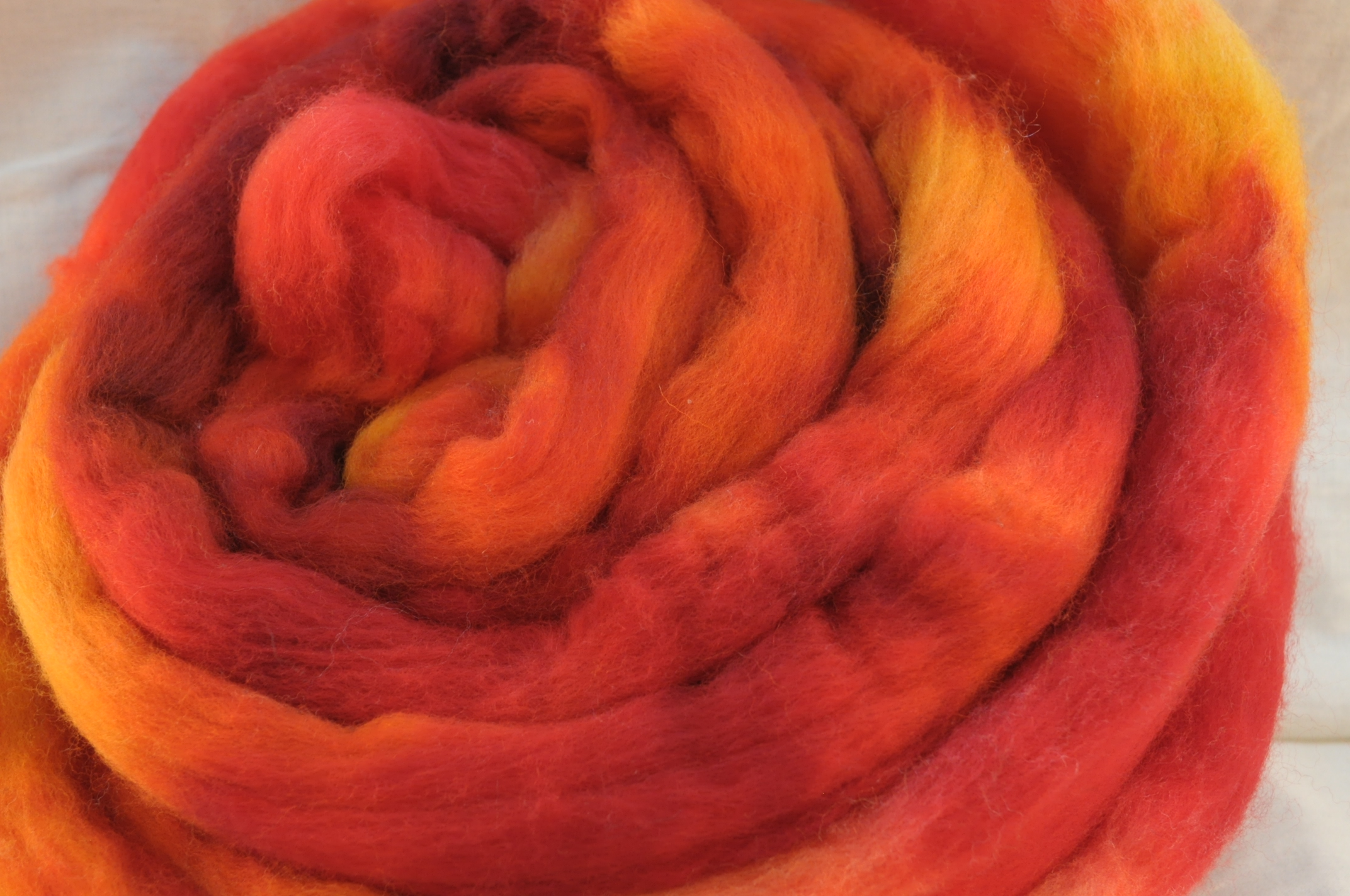
With two sweaters approaching completion, I’ve been busily working away at a new design to take their place on the needles. The fall colors sweater is going to require spinning before it can be knit, so I turned back to the other yarn that has been waiting patiently in line.

I bought this yarn because I loved the vibrancy of the colors, but I knew it was going to take some very careful designing to turn it into something that I would wear. I wanted a pattern that would tone it down with a lot of black, but that would also highlight and flatter the colors.

My first thought was stained glass, but for that I’d need isolated blocks of all the different colors. Since they’re dyed in 6-inch segments, that would either mean a lot of ends or figuring out how to do something useful with stripes.

At first, I came up with this:

It would require an interesting construction, but I planned to knit the jacket from the outside in, so that the stripes at the edge could be knit in a single uninterrupted stripe of stockinette. I worked out the geometry for the front, and even put in some waist shaping, but I just couldn’t make the back work. I knit up 5 or 6 scaled down model versions to try to get the shaping to work out so that the back would lie flat, but it was just not cooperating. I’m all for process knitting, but I don’t think I’m willing to knit a whole sweater in a very odd shape just to decide that the back doesn’t work and rip it all out again. So, much as I like this design, it went to the scrap pile (at least for now…I leave open the option of it making a comeback).

Next, I thought about keeping the semi-angled front opening, but fitting it to a more standard construction.

I like the garment itself, but the stripes become kind of a design detail rather than the focal point of the garment. And I wanted that accent yarn front and center in the design.

Then I thought about other standard constructions that work with stripes. I could do a yoked sweater:

Or a raglan, for sharper edges in the color stripes.

I liked both of these options, but wasn’t sure they were the best we could do, so I kept sketching.

Bolero-type jackets do appeal to me, though I have yet to really wear one. Still, I like to play around with them in the sketching stage, in the hope that I will someday find one that I absolutely must knit.

I like the second one quite a lot, but I’m afraid today is still not the day for a short jacket. (But maybe that design in a different and plainer yarn. Olive green, perhaps, with chocolate stripes. Or a dark gray, with a mauve accent yarn for the stripes and button band.)

Or, I could use a fitted body with set in sleeves, and do non-standard striping.

I love this design. That surprises me, because I don’t think of myself as much of a horizontal stripes person, but I really like the way they’d highlight the shaping, especially if they’re not evenly spaced. If not now, this is a sweater that I would like to knit someday. But it’s high on the list of contenders for today, too.

Or, I could do one of those shadow-knits that are knit sideways and give a garter stitch striping effect.

I like the idea in principle, but I’ve seen a few of those sweaters in person and didn’t love the way they hang as they stretch with use. (I’m also not sure I have enough of the accent yarn.) Perhaps a firm enough fabric would be able to hold its own against gravity, but I’m not sure.

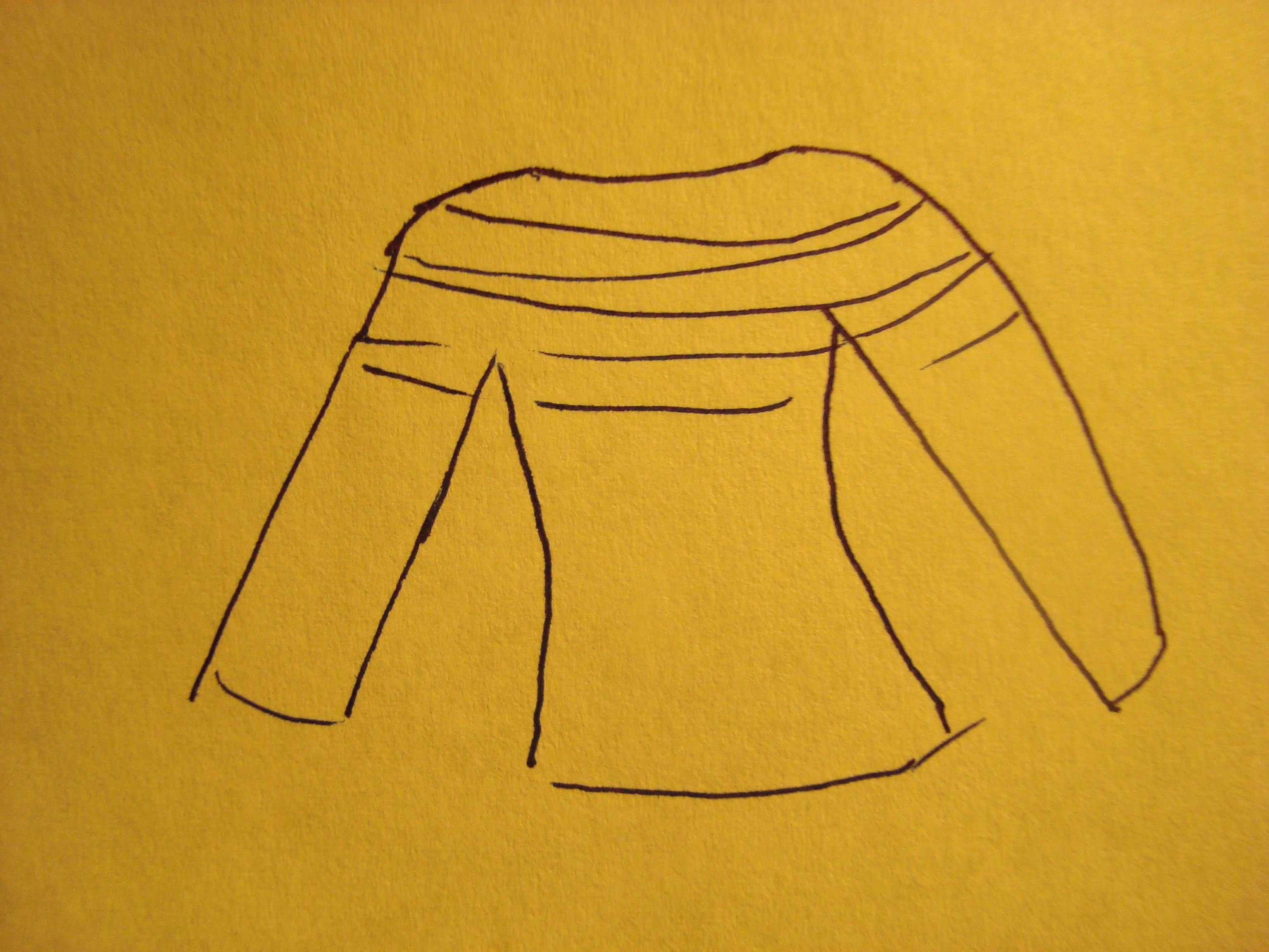
Then came the sketch that I lovingly think of as grandpa’s pajama top:

And I guess that’s all I really need to say about that one.

But there was something interesting hiding in there, too. What if I did a little nip and tuck here and there to add some shaping, and changed the neck a bit?

It’s a simple sweater; just a fitted body with set in sleeves. Couldn’t be easier, really. Worked the right way, the stripes will accent the curves, and should stand out front and center in the design.

But how to make the stripes? It seemed like intarsia would be the best choice. Just a solid stripe, a few stitches wide. I wasn’t sure what that would do with the color repeat, though. So, I swatched.

And I didn’t love it. The repeats are very short (only about an inch), and having several stitches across allows them to mix together more than I wanted. Also, it’s a pain in the neck to make a three-stitch-wide strip lay flat. So, I put it on a black background to hold it in place.

Still not in love, but what if I go down to a single stitch?

Now that’s more like it. The color segments are now a couple of inches long, and there’s a much more gradual transition from one to the other. Stretching the repeat out like this highlights all the beautiful colors in the yarn, but without letting it devolve into a chaos of colors.

Then, I thought about the painted warp weaving that I’ve seen. Here’s an example from Daryl Lancaster’s collection, which I saw in person in my class at Rhinebeck:

The effect is achieved by dyeing two separate warps (the threads that go lengthwise along the fabric), and then shifting them relative to one another so that the color repeats are offset.

I found the full color repeat of the yarn (about 3 yards), and laid out 6 strands next to one another. Then I lined them up so that I liked the colors that ended up next to one another. I marked the strands, and began knitting them into a black background.

You can see here that I had two different sets of color repeats, in groups of three. In each group, the two outer stripes change together, and the inner one is on a different repeat. After seeing this swatched up, I think I’d prefer it if all the stripes change at the same time for this yarn. But I can imagine lots of things that you could do with this general idea, especially in more subtly-shifting colors with a foreground and a background that can be offset.

I also played with the spacing of the stripes. I started out with three stitches between them, then reduced to two, then to one. I had intended to do my shaping in the wider black areas between the stripes, but I actually like the way this looks, so I may do some shaping in between, too. If I do keep the stripe spacing constant, I like the single-stitch spacing the best.

I love the way the reverse side looks, too. So nice and neat. All the intarsia wraps line up, and create “vertical purl stitches” as Branden put it.

I think this may be it.

I’ve said before that I’m not very good at the artistic arrangement of stripes, so I’ve been doing due diligence on Google image search trying to find a pattern that will work here. I’m not stuck on groups of three, and actually I’m thinking that a more random arrangement will probably work better. I’ll also need to decide where to put the color repeats in the garment (neon pink on the bust shaping, or at the waist? Don’t want that to end up in the wrong place by mistake…), but I think this could work well.

And if not, I suppose I can always fall back to the fitted sweater with the horizontal stripes. I really like that one as well. So many options. And none of them take all that much of the accent yarn, so I suppose I could always make more than one…

(This is how I end up with more designs than I will ever knit. Every project creates 6 more sketches I really want to try.)

Branden was out of town for work this weekend, which left me to my own devices. An empty calendar meant that I was free to play with fiber for two whole days.

It’s not unusual for me to have a lot of fiber time on the weekends, but this time I went even further. The house was not cleaned, I survived on scrambled eggs and whatever leftovers I could find in the fridge, and pretty much nothing got done except fibery things. That is very unusual. It’s probably been a year since my last do-nothing-but-what-I-feel-like-at-the-moment weekend.

And I felt like playing with fiber. On Saturday, I made color:

We’ll take some decent pictures this weekend, and I’ll tell you all about them then. But for now, look at the pretty blue-greens!

On Sunday, I made more color:

Those are the browns and greens for the fall colors sweater. I hope. They hadn’t dried yet when I took the photo, but I think the colors came out all right to match the red/orange colorway.

I had forgotten how much work it is to dye large quantities, and how much dye it takes. That was some thirsty fiber! I made more dye than I thought I’d need, and then I went back and made twice as much again. I even ran out of two colors in the process, which just doesn’t happen in my overstocked studio. Never fear, though – there is more on order. (And it turns out it’s a lot cheaper to buy the 8 oz tubs of dye than the 1/2 oz jars…I will never run out again!)

Ironically, I realized while calculating how much fiber to dye that I am probably going to have a lot of extra yarn for this sweater if I use the current design. I dyed a few ounces more than I expect to need in each color (better to be safe than sorry), and with a colorwork body I will probably have extra of the red/orange, too. I think I’m ok with extra yarn, though.

I’ll probably hold aside 4 oz of the brown and green, and post them to the shop if I end up not needing them for the sweater. That puts me at risk for another sweater of going back and spinning more, but I think I’ll make it without using up the buffer. I guess we’ll see how the yardage is adding up when I spin it. I am very pleased with how evenly the colors are distributed on the fiber, so I should get fairly even “dyelots” between skeins when it’s spun up.

Unfortunately, it takes forever for wool to cool after dyeing. After I apply the dye, I bundle the fiber in plastic wrap and steam it in the dyepots for 30-40 minutes. Then the pots need to cool. Slowly. Without being disturbed. I usually leave them overnight and rinse in the morning. If I finish dyeing by 1 or 2, I can sometimes get the rinsing in before bedtime, but it takes a very long time for the wool to cool completely. The only times that I have felted fiber is when I rush this step, and it is very hard not to rush this step. (You can’t see the colors until you take the fiber out to rinse, and it is very hard not to peek at the colors.)

Finn appears to be especially finicky in this regard; I have only mildly felted roving once in my dyeing career, except for Finn. I lose at least one colorway each time I dye, it seems, even when I treat the Finn exactly the same as all the other fibers that I dye in the same batch. Of course, what I call felted isn’t unusable. It’s more pre-felted, I guess.  The individual fibers don’t really stick to each other; they just get a little coarser, and sometimes catch a tiny bit while drafting. I suspect that the scales have started to open up, but that the actual felting hasn’t begun. It’s usually just a tiny bit around the very outside layer, but it’s enough of a difference that I won’t sell that roving, and it gets put aside for future use. (It also happens to mean that my private stash of Finn is doing quite well, which I suppose is a plus.)

Since I didn’t want a huge addition to the slightly pre-felted Finn collection, I left the dyepots overnight (I didn’t even open the lid to peek!) and snuck in a few minutes at lunchtime today to rinse the fiber. I finished dyeing at 3:00 yesterday afternoon, and I thought I could still feel a tiny bit of heat in the very center of the bundles today at noon. Wet wool is a good insulator indeed.

I’m itching to get started on the spinning, just as soon as the fiber finishes drying. Our basement dehumidifier does a pretty good job, so it should be done by tomorrow.

Since I need to get back to spinning for the fall colors sweater, I started looking about for another project to put on the needles next. I’ve begun sketching and swatching for a sweater from the yarn I bought at Stitches:

I am very excited about that, but it’s enough to be a whole ‘nother post, so we’ll get to that later.

The second sleeve of the Falkland sweater is halfway complete, and I finished charting it out so that I can use this sleeve to test the increase section.  It’s like real documentation…scary thought indeed.

And then, last night I began winding a warp for the next project to go on the loom. About halfway through, I realized that I’m going to run out of yarn. This really surprised me; all of my previous experience suggests that cones are magically endless sources of yarn. But not this time. Looks like I’ll need to order more before I can get any further on that project.

Turns out I got a lot done for a weekend of doing absolutely nothing. Now I just need to catch up on that cleaning…

When I first envisioned the fall colors sweater, I thought it would be something lacy. Probably a cardigan, with vertical lace panels separated by some spacers. Something like this, perhaps:

But then the issue of grist meant that I ended up with 30% less yarn than I’d expected from that fiber. Fortunately, I am working on the Falkland lace sweater at the same time, with the same yardage. So I have a pretty good idea of how far 928 yards will stretch.

The answer is that it will stretch enough, but only if I want a lightweight sweater with very open lace. I happen to love the way the Falkland sweater is coming out, but it’s probably not a weight that I’ll use for more than a few months a year, and definitely not in the fall. Also, I think that a lace that open really needs a semi-solid yarn to keep the color from fighting with the lace pattern. This yarn might work in a more solid lace, but I think it would be too much variegation for a really open pattern.

So that sent me back to the drawing board. Somewhere in our emails back and forth, Jan suggested that maybe a Chanel-inspired jacket would be the thing. This had me enchanted for quite a while, trying to figure out how I might stretch the yarn to make it work. It would have to be a short jacket because of the yarn restrictions, but I could use a different color as trim to help stretch it out a bit.

Unfortunately, I’d want this to be a really solid, stable fabric, probably with an almost woven texture. And that spells heavy yardage requirements. I thought about using two colors at once and dyeing something to match, but I still don’t think that will stretch the yardage enough.

I also thought about actually weaving it. You get a lot more fabric for the yardage with weaving than you do with knitting, so I could make this go farther on the loom. I’d also be using a different yarn for the warp, so I’d automatically get twice as far. I did some calculations, and really looked carefully at what it would take to cut these pieces from the widest fabric I can make on my loom, and I think it would still be cutting it a little too close. If I wanted a really cropped jacket or short sleeves I could probably make it work, but I think I’m unlikely to have occasion to wear either of those styles very often.

So. Definitely keeping this jacket idea in the active list, but probably not in this yarn. I think it would look great knit up, though.

Then I thought about working a more fitted jacket and having the sleeves in a contrasting color. The extra fitting takes out a significant portion of the yardage, and the contrasting sleeves cut out a lot more. If the body were worked in two colors, I might have enough to make it on this design. Based on the gauge of the Falkland sweater, I still don’t think I could get the full vest out of the fall colors yarn in stockinette. But colorwork might just do it here.

Next, I started thinking raglans. These are nice and simple, because you just start at the top and knit until you run out of yarn. They’re also very safe projects for me, because I’ve done enough of them to know that it will turn into something I’m likely to wear. (Though, incidentally, I have yet to actually knit myself a raglan.) I was thinking of something like this, minus the gorilla shoulders:

Olive green semisolid at the neck would put a spacer between the orange and my skin tone (one of the reasons that I don’t wear orange much is that I have a good bit of yellow in my skin and sometimes yellow/orange can make me look jaundiced). Then I’d do a dark brown for the main body, tying in both the greens and browns of fall. This could work, and it was actually my #1 choice until I sat down and started drawing these out. Seeing it on the page, though, it’s not quite as appealing as some of the other options. It’s still high on the list, but I’m not sure it’s right for this yarn.

I could also do some kind of colorwork or striping to spread the orange highlight yarn out over the entire sweater.

If done well, I think this could be absolutely stunning. Unfortunately, artistic arrangement of stripes is not my greatest strength. I am usually a little too mathematical and geometrical to come up with the kinds of dynamic striping that I’d want here. The sketch makes it look rather unappealing, doesn’t it?

I could do a raglan design with the fall colors yarn as an accent band, but I want it to stand front and center in the design, and I’d like to use up the yarn that I have. (Yes, I know. I am picky, picky, picky in the design phase. That’s why I usually end up with things that I like in the end.)

My current favorite leans back toward the more tailored jacket look, and is loosely based on a commercial sweater that I wear all the time.

This would be a zip-front cardigan that’s fitted but still has a good bit of ease. It’s a more casual cut, so I’m more likely to wear it often. The seam between the side panels and the front fabric would give it a nice silhouette look, especially if there’s a strong contrast between bright body and dark panel colors. The sleeves could be a contrast color, and the underarms would be a solid or semi-solid to match the sleeves. That would take out a good 8″ of fabric from the body alone, helping the yarn to stretch further. The rest of the body could then be colorwork or a two-color textured pattern to stretch the yardage again (which should make up for the extra density of the fabric). I’d probably do an olivey-green for the sleeves and underarm panels, and a deep, dark brown for the other body yarn.

This could be done with any number of colorwork or texture designs. The dark brown should help the orange to “pop”, like the dark branches highlighting the fall foliage. Adding in the green and brown also pulls this closer into my usual color palette and might make it more likely that I’ll wear it often.

I’m a little torn about that last part. Practically speaking, I do think that I’m more likely to wear greens and browns than just orange. I was kind of in love with the pure orange-reds, though. The strong, bold colors are the whole point of this project, after all. I don’t want to dilute them down. I also don’t want this to be something that has to be worn as an earth-tone; I like the idea of making it a real focus piece. I think that I should be able to come up with a colorwork design that uses the darker colors to highlight the oranges, though. If I’m good, I should be able to use the design to narrow the focus even further, from the garment level right down to the individual yarns.

I don’t know if I’m that good, but I think I want to try.

The other slightly scary thing about this design is the construction. I haven’t done much designing for seamed sweaters, so this one will be a bit of a stretch. Add to that the fact that there will be 5 body panels, and that’s a lot of planning. I’m thinking of doing it with steeks, which will let me do the colorwork in the round and then seam at the end, but that means no trying on and checking of design along the way. It will also be a very oddly shaped garment until the steeks are cut.

I think that’s manageable, though. Those lines aren’t really very complicated, and I really like the semi-tailored look that the side panels give to the design. It’s not a closely fitted garment, so there should be some room to adjust at the end, if necessary. It would also give me a reason to steek a full sweater, which very much appeals to the seamstressy side of me. The colorwork and contrasting sleeves will guarantee that I have enough of the focus yarn, and I can dye and spin up as much as I need of the other colors.

So, I think this is it. Still dithering, poking around and exploring other ideas. I’d still need to sit down and figure out how much more yarn I need to spin, and to decide on the perfect colors to match. Solid? Semi-solid? Something else?

So many decisions still to make, but I think we’re getting closer.

The annual Fine Art of Fiber festival was this past weekend at the Chicago Botanic Gardens. The festival is put on by the Illinois Quilters, the North Suburban Needle Arts Guild, and the Weavers Guild of the North Shore.

We were expecting something fairly small, maybe a few rooms of pieces on display. We were completely unprepared for the size of this show. There were at least 3 display rooms with every surface covered in quilts, a display of handmade aprons, and two large rooms full of weaving and other crafts for sale.

I expected that we’d spend an hour or two and then go for a stroll around the gardens afterward. We spent the entire day.

This was one of my favorite pieces in the show. I love how the quilter used different values and saturations of color to really make the squares pop. It’s also interesting how the different colors interact; I wouldn’t usually think to mix pink and orange, but they complement one another beautifully here, and I think that contrast is part of what gives the quilt depth. Their placement also keeps your eye moving around the quilt, giving it a really dynamic feel.

Quilting, like weaving, is all about color composition. It’s something I’m not very good at (yet), but I appreciate it in others’ work. We kept circling back around past this one throughout the day, and every time I passed I liked it more.

Here’s another one where the color pattern was carefully chosen to highlight the woven look of the quilt. This must have been an awful pain to construct, since those pieces  can’t be sewn as squares and have to be pieced as “L” shapes (corner seams don’t tend to like to lie flat).

This one I liked for the sheer boldness of its design, and it’s jagged feel. It’s saw edges and z’s and broken glass all at once.  I’ve read somewhere that there are certain commonalities in how sounds are represented across languages and cultures; that a curvy shape has a soft sound, and a sharp shape represents hard, crisp sounds. To me, this quilt is the visual equivalent of that. It practically crackles, doesn’t it?

This was almost the exact opposite. Subtle, calm, understated. A forest of trees that is almost there, and almost not. I think the background fabric on this one was handpainted, too. Loved the color blending, and the way the three-dimensional leaves brought out the background.

This piece was another jaw-dropper in terms of color composition.

And just look at the details in the quilting!

Another thing that this show really brought home is the importance of beautiful quilting to finish a piece. I don’t have much to show there, because it’s hard to take pictures that actually show quilting, but when well done, it really elevates a quilt from nice to spectacular.

Here’s an example of a very plain background that became a lot more interesting with quilting. All those flowers are quilted in. Without those details, the butterfly would be on a plain red background.

As with anything, I suppose, the genius is in the details, and in pulling them all together to make a coherent whole. It was fun to spend a day studying so many masterpieces.

There was a woman demonstrating bobbin lace, which I’ve been tempted to try for quite some time. She managed to make it sound quite simple despite its apparent complexity, too. Turns out that’s all just one “stitch” too. Just like knitting…you take one simple thing and make complicated patterns. She had a sample for people to practice on. I declined, out of fear of gaining another hobby on the spot. Fortunately, I know I will never run out of things to explore in the craft world.

We also sat in on a lecture by the owner of Kasuri dyeworks about Japanese textiles. I didn’t take photos, but it was an amazing hour, packed full of information about the techniques of Japanese master dyers and weavers. There is so much history in those pieces of fabric. It literally takes a lifetime to master these crafts (she said that one of the weavers she works with is considered “up and coming” after 30+ years of apprenticeship). We found ourselves shaking our heads and saying “only the Japanese” so often during the lecture. There is so much careful attention to detail, so much miniaturized and painstaking work, and such emphasis on perfection of their craft. The fabrics were truly beautiful, and the culture behind them was just as interesting. I’d highly recommend that anyone sit in on one of these lectures if you get the chance; even if you don’t weave or dye, it was an amazing way to spend an hour.

We didn’t take photos of the woven pieces on display, unfortunately. They didn’t have any for show only, and people can be funny about you taking pictures of things that are for sale, so we opted to just look. I’ve decided that I really must play with huck lace, and have reinforced the idea that I want to weave very fine (50-100 ends per inch seems like a good goal for now, just as soon as I can get enough heddles to thread the loom with that many ends!). I also discovered that I like very lightweight chenille much, much more than the slightly heavier-weight kind that I’ve usually seen.

We saw some examples of garments with beautiful finishing details, which is of particular interest to me because that’s where my weaving is headed (eventually, anyway). Again, the details really make the piece. I only barely managed to avoid taking a finely finished jacket home with me as a new addition to my wardrobe. Next year, maybe.

In all, it was a long but fun day. So many inspiring things to see, a million more directions to explore. It did poke my dormant quilting itch, and has gotten my brain turning on some new ideas for weaving projects. Definitely an event to attend again next year. (And who knows…maybe to enter, too?)

Tonight, I have two things to tell you about.

First, there is a sweater that has two (!) sleeves.

It actually would have had two sleeves sometime last week, except that I ran out of yarn again and had to spin more. Next time, I am going back to overspinning.

Also, the sweater isn’t really done yet. I wanted to check the fit before weaving in ends, and then there was some resistance when it came time to give it back (it is cold in the house now, so I really can’t blame him).  We’ll do a proper modeled shot sometime when it’s been finished and blocked, and when there is light so you can actually see it.

The other exciting thing came in the form of two boxes left on my front porch today:

Don’t listen to the cat. It is not a new kitty pedestal.

Instead, it is another 12 pounds of fiber for the shop, since my last big dye day left me fresh out of Finn and low on Polwarth.  I find that to be infinitely more interesting than a new cat elevation system, but Mischief has yet to be convinced. She will probably be won over in no time once the boxes are open and she can pop in and out of them, though.

This time, I added Falkland to the must-order list, so we have Finn, Polwarth, BFL, and Falkland to play with. I desperately need to do some sampling, but I can’t wait to dive in!

In my (metaphorical) knitting basket, there lie two sweaters, waiting for sleeves.

One is thick and warm, the other light and airy. They are both eagerly awaiting the pieces that complete them. Between them, I count one finished sleeve and two begun.

Tonight, when I ask the question: “What shall I knit?” there can only be one answer. The real question is “blue, or brown?”